Assignment 7
Assignment 7: AI Exercise
Shiny App 1: University Database - Instructor Salaries
For the first Shiny application, I ran the app.R file in the Lab/R/Shiny/1 Teams folder and entered my PostgreSQL password so the application could connect to my local university database. The app successfully displayed average instructor salary by department.
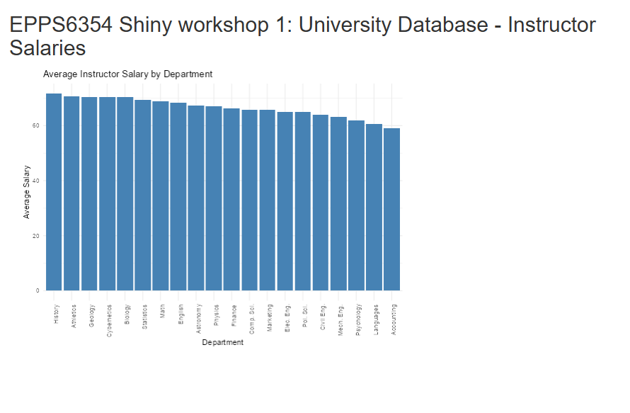
Change 1: Sort Salary from High to Low
To change the salary sorting from high to low, I modified the ggplot() line from:
ggplot(data, aes(x = reorder(dept_name, avg_salary), y = avg_salary)) +to:
ggplot(data, aes(x = reorder(dept_name, -avg_salary), y = avg_salary)) +Result: Salary Sorted High to Low

Change 2: Try Another Variable in Another Table
I then modified the query to use the student table and calculate the average total credits by department instead of average instructor salary.
The query was changed from:
query <- "SELECT dept_name, AVG(salary) AS avg_salary
          FROM instructor
          GROUP BY dept_name;"
to:
query <- "SELECT dept_name, AVG(tot_cred) AS avg_salary
          FROM student
          GROUP BY dept_name;"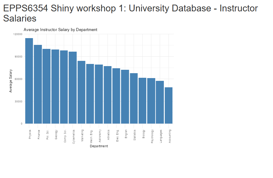
Updated App Code for Student Table
instructor_data <- reactive({
  query <- "SELECT dept_name, AVG(tot_cred) AS avg_salary
            FROM student
            GROUP BY dept_name;"
  dbGetQuery(con, query)
})
Result: Average Total Credits by Department
Shiny App 2: Old Faithful Geyser Data
For the second Shiny application, I ran the app.R file in the R/Shiny/2 Teams folder and changed the histogram color.
Original Histogram Code
hist(x, breaks = bins, col = "blue", border = "white",
     xlab = "Waiting time to next eruption (in mins)",
     main = "Histogram of waiting times")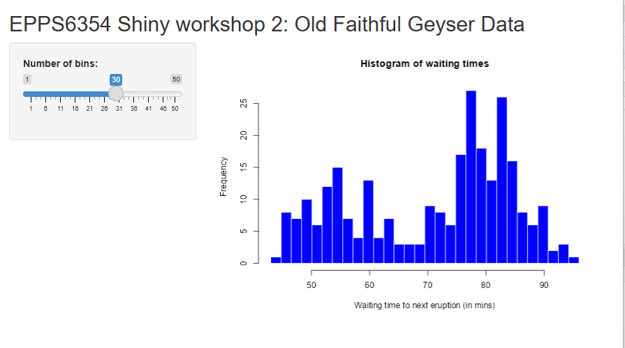
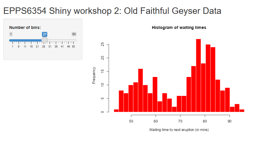
Updated Histogram Code
hist(x, breaks = bins, col = "red", border = "white",
     xlab = "Waiting time to next eruption (in mins)",
     main = "Histogram of waiting times")
Result: Histogram with Changed Color
Conclusion
In this assignment, I successfully ran both Shiny applications. In the first app, I connected to my local PostgreSQL database, changed the bar chart sorting from low-to-high to high-to-low, and then modified the app to use another variable from another table. In the second app, I changed the histogram color from blue to red. These changes demonstrate how Shiny applications can be customized both in terms of data source and visual presentation.